

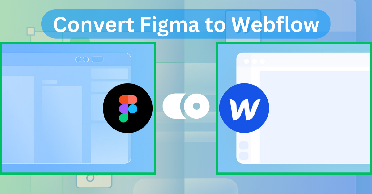

The concept of pushing your beautiful design from Figma to Webflow can be a massive jump, especially when you want just about everything to stay perfect. You are probably spending so much time cleaning your design in Figma, and you wouldn't want that to go live on Webflow looking any less polished.
The good thing is that moving your design from Figma to Webflow doesn't have to be difficult. Follow a well-structured process and prepare to make the transition seamless.
Whether you are a complete newbie in Webflow or simply looking for the best way to bring your Figma design to life, this guide will walk you through the entire process step by step. Let’s get started on how to use Figma to Webflow plugin? and convert your design without losing even an inch of your design magic.
Convert Figma to Webflow - Step-By-Step Guide
Below follows an explanation of how one can work through the Figma and Webflow process outlined in three clear parts:
- How to prepare your design for a seamless transition.
- The best way to transfer your Figma design elements into Webflow.
- Final steps for refining and launching your website, ensuring everything is perfect before going live.
Part 1: How to Prepare for Figma to Webflow Conversion in Basic Ways
A few important steps before you start converting your Figma design into Webflow will make sure that it goes right as rain. Proper preparation will save you from issues and more time being used later on.
- Prep Complete: An account with Webflow and full access to design files in Figma. Having these set up before commencing the conversion will save you from hiccups along the way.
- Responsiveness: This is one of the most essential aspects; the website should look good on every screen size. While you get ready with your Figma design, think about how elements will scale on mobile, tablet, and desktop.
- Familiarize yourself with the Webflow interface: interactions, class structuring, and auto layout of elements differ from Figma. Take the time to get used to the Webflow interface so that this transfer will feel intuitive when you start actually converting it. Figma vs Webflow tools may feel different at first, but you'll find that understanding both can make the transition smoother.
The Figma-Webflow integration enables designers who make designs in Figma to push them into Webflow, enabling a smoother workflow and ensuring that the designs are preserved.
That way, you will be properly prepared for the conversion, and this can make it somewhat easier to actually translate a design into a functioning website.
Part 2: How to Efficiently Transfer Figma Designs to Webflow
It doesn't get weirder than this! Now that you're all set let's bring your Figma to Webflow piece by piece.
Step 1: Create Your First Webflow Project
Now it's your turn; it is time for you to create a new Webflow project. Here's how:
- Log in to Webflow: If you happen not to have a Webflow account, create one. It's free for small projects.
- Open Dashboard: Upon logging in, it directly opens the Webflow dashboard, listing all your projects.
- New Project: The "New Project" button is on the top right; click to create a new project by selecting any of the pre-made templates or to start completely from scratch.
- Name Your Project: Keep your project name significant in meaning and easy to remember.
- Customize settings: Now it is time to set up the basic settings: SEO settings, meta descriptions, and general project preferences.
- Enter Webflow Designer: Once your project is set, you'll enter the Webflow interface called Designer where you build your website.
This gives you a good structure on which you can start importing design elements from Figma. You'll now be able to import Figma designs into Webflow with just one click. Save time and let your elements transition smoothly.
Step 2: Designing Your Global Branding Rules
Well-defined global styles are the very foundation of a consistent, professional website to begin with. They set in stone how the typography, colors, spacing, and elements should be created within your site for consistency. If you are looking to convert Figma to Webflow, having these styles set will definitely make that transition easier and keep your design cohesive within the platform.
- Clone a Base Style Guide: Webflow has ready base style guides or HTML tag templates that you can clone with just a few clicks into your project. This sets the skeleton for creating global styles.
- Style Guide Page: A new page will be created in Webflow that will house or will be in control of all the global styles. On this page, it will be possible to approximate how some of the design elements on headings, paragraphs, buttons, and links would look throughout one's site.
- Apply Global Styles: In Webflow, select any element, let's say a heading or a paragraph, and apply a global style to it. This will instantly make the styles uniform throughout your site for all instances of that element.
- Customize and Save: You may also want to change the font type, color, size, and space in order to fit the design in Figma. Sustain after every significant change.
Step 3: Prepare and Send Your Figma Designs to Webflow
Now, the important part: preparing and sending all of the actual design assets from Figma into Webflow meaning all the images, icons and every converting graphical. If you're feeling deeply frustrated with Figma to Webflow convert you're not alone—this step often throws designers for a loop. Here's how to manage it effectively:
1. Select your assets
Go to your design file in Figma and choose which elements to Convert. These could be logos, images, or all the icons used in the work. Since you have already flagged them during the beginning, you're better off heading out!
2. Define the Export Format
Now that you've chosen your assets, it's time to fire up the export dialog. To do so:
- Ctrl + Shift + E on Windows.
- For Mac, press the keys Command + Shift + E. You'll see a menu where you can choose the format.
I suggest SVG use for scalable vector graphics or PNG for images, whichever you'll need.
3. Click Convert
Depending on the format chosen, hit on the “Convert” button. After a calculation has been performed, Figma will ask the user whether she or he wants to store the result in a folder.
4. Organize Your Assets
You should also save your work on your computer in different properly named folders for importing onto Webflow by making folders such as ‘icons’ ‘images’.
5. Upload into Webflow
Navigate to Open Webflow and go to the Assets Panel, which is represented as a folder with a small arrow beside it, you either drag and drop files to it or click on it and choose “Upload” on the right top corner. Webflow will automatically create the matching folders if, in Figma, your files are organized with slashes such as icons/navigation.
Step 4: Using Divs to Frame Your Webflow Site

Here, we go into one of the most important aspects of how to add Figma to Webflow: How to div-frame our website in Webflow. This can be a huge step involved in composing your Figma design into a well-structured, responsive layout.
1. Create a Basic Layout
Visualize Your Framework:
If making use of Figma, now create a basic setup for each of the following foundational sections:
- Header: This is where your logo and prime navigation menu go; it will set the tone and accessibility of your site.
- Footer: Reinforce navigation - one or two other links or resources here so visitors can get to the most salient information quickly.
- Navigation Bar: This should carry the links to the main pages so that one can navigate around easily and swiftly within your site.
- Image Description Main Content Area: This is the place where you should put all your major information; you could do this in an unambiguous and concise way yet in an engaging fashion to hold attention.
2. Insert Div-Frames
Drag-and-Drop in Webflow:
Open the Elements panel in Webflow and start dropping some elements onto your canvas. Each div you add is purposed to make logical divisions or segments of content.
- Use container divs: Tend to keep your design modular; that way, it will be easier to edit later. Divs are the best way to wrap up your content and have better styles with further layout control.
- Nested containers Here, adding divs within divs will help in fine structuring. This practice, when followed, cleans up the design and keeps it maintainable even in complex sections.
Organizing Effectively
Name Convention: Give them obvious and different names for each div, for instance, “Header-Nav” or “Main-Content”. That way, it will be easy to locate items within Webflow once your project becomes complex enough.
Step 5: Making Your Webflow Content Look Great
Now that you have framed your site with divs, it's time to give it an attractive look by styling the content of figma to webflow. This is where you want to bring your Figma design to life visually; however, remember that your site will be consumed on different devices.
1. Choosing the Element Targeted for Style
Any object is to be clicked- headlines, images, or buttons; a Style Panel, which is highlighted on the right side of the website screen, will appear.
2. Adjust the Appearance
You can extend its appearance using whatever best fits your design style.
- Color: Decide which of the colors you want to use as text, background, and borders. Based on your brand.
- Fonts: Typography should be aligned with the design of Figma and, therefore, consistent.
- Font Size: Chor, using the browser’s customizations utility or by using the CSS commands, increase or decrease the font size of the headings, the rest of the body text, and any other item that would require it.
- Spacing: Some regulations will also be made over the height of lines and between letters to ensure good readability.
- Borders & Shadows: If you want to add depth and stress some of the elements, put borders and shadows.
3. Global Styles for Consistency
Apply Global Styles to make your design feel consistent from page to page on the site. From there, use the Class Selector to apply instant styles you've already set up in your design system or create new ones for consistent reuse across your site, such as "Primary Button" or "Main Heading.
4. Combo Classes for Flexibility
Combo Classes let you apply many styles to elements. For Example:
- H1 Headings + Bold: This will style all your H1 headings with the same look and feel, offering you size, weight, and auto layout control.
Combo Classes allow for a ton of flexibility and will make it easy to change one element without affecting another.
5. Be Prepared for Some Changes
Some designs can be created once as Figma designs but may require some tuning in order to be effectively ported to Webflow. Expect some perspectives to function somewhat differently in Webflow as opposed to Figma, and the spacing, fonts, or layout of the site could shift after it goes live.
Step 6: Interaction Specifications

Interactions can really affect the user experience of your website. Transitioning from Figma to Webflow involves smooth and engaging interactions. This is where the Figma to Webflow plugin comes in handy, and you can use it to make this process even smoother. However, here is a focused guide on defining and implementing interactions within Webflow itself.
1. Open the Interactions Panel
If you are working in the Webflow workspace, move a little to your right, and you will find something called Interactions. Here you find the controls for Animations and Interaction.
2. Choose Element to Interact
It allows to define what element should be animated — the button, an image or a piece of text — so that the interaction would be applied to the correct content.
3. Choose Interaction Type
Webflow has different out of the box interactive features.
- Hover Effects: Add transitions such as background changes or scaling into buttons and images to make them more interesting for interaction.
- Scroll Animations: Configure the animations to fire when the user scrolls down and takes him through your content.
- Page Load Animations: These validate animations of elements when a page is loaded, getting the tone just right.
4. Creative and Strategic
Strategically applying interactions to enhance site functionality:
- Visual feedback: For example, if lowering the opacity or changing its color is not compelling enough, buttons can jump or change color at the point of being clicked to make clear that they are clickable.
- Sticky navigation bars: This makes the navigation available because it will be sticky and follow you as you scroll on the page.
5. Figma Prototypes vs. Webflow
Webflow lets you build more complex, dynamic interactions than Figma. From adding basic interactions to anything to attaching it consistently using classes, it is pretty easy. You can chain a few of these together in order to make really fluid, animated experiences throughout your app or website.
6. All-in-one for Interaction
One cool thing about Webflow is that you will not need to use additional tools to create animations since you can do everything with this very tool.
Instead, this means that you can iterate and try interactions much faster; you end up more quickly honing in on what feels just right for your audience.
7. Prepare the Way for Future Enhancements
Interactions and animations are a huge topic. Once you get used to the basics, feel free to advance into expert techniques, including custom animations, triggers, and sequences. Webflow has extensive documentation and tutorials that will help you conquer those skills.
Step 7: Going Mobile
Designing for mobile in Webflow does feel a little different than you would expect, especially with this mobile-first mindset. Here is a clear breakdown of how you go about it:
1. Mobile Breakpoints
- Mobile-First Design: Normally, you design the mobile version first and do not adapt any design you have done for the desktop version. That way, you are going to be assured that your website is going to work just fine with small screens and, at the same time, clean them from elements that are not necessary for a great user experience.
- Breakpoints: in Webflow, this refers to the way your design adapts to different kinds of screens. Normally, you begin styling for mobile breakpoints, which range from 320px to 767px.
2. Understanding Componential Behavior
- Instance of Components: Webflow components are the same as in Figma. You will have a master component- a kind of template- and then apply that component's attributes throughout your design in various instances of that component.
- Overrides: While general styles are defined from the master component, there are instances where you sometimes wish to override some particular attribute features related to instances so as to enable some flexibility in your design.
3. Desktop vs. Mobile Design
- Desktop-first approach: Since Webflow is designed for the desktop first, in most cases, many of the design processes are directed or started with larger screens. That will be very problematic in adaptation to mobile because, in that place, the site will look different from how it should be.
- Responsifying: After getting your design set for the desktop, you can fine-tune some of them for mobile view. When working with Webflow, begin with the responsive design tools and apply padding, font size, and other settings, which are suitable for a mobile user.
Pro Tip: Emphasize Important Features
- Prioritize Content: Due to generally smaller screen size of the devices, mobile web design should pay more attention to the concept of priority.
- Touch Targets: With respect to interactive elements and buttons, they should be large enough to react appropriately to the taps of end-users on mobile devices for a good user experience.
Part 3: Finishing Touch to Figma-to-Webflow Projects: How to Launch Your Website
Almost there, of our Figma to Webflow journey! But before you tie the final knots, let me do some last checks with a few simple steps to make sure everything is in order.
- Ensure all components on your website are checked from one browser to another browser and from one device to another device to ensure Figma components look good and functional on all platforms.
- See if there are any problems in this area that can be spoken of as related to design or layout, such as spacing or alignment requirements.
When satisfied, go to the options in Webflow, choose Publish, and click through. This pushes the site to be live for all to see.
Pro Tip: Give a last check on your site's functionality, especially on mobile.
EndNote
If everything looks good, now is the time to present it to the world! Closure And there you have it! Follow these steps, and you'll successfully bring your designs from Figma to Webflow without losing any special details. Maybe a little tricky in the first tries, but with practice, you will feel comfortable with the process. Soon enough, you will have beautiful, live sites taken just as they look in Figma. Just know that each and every project allows you a chance to learn and subscribe to improvements. Therefore, keep experimenting, be patient, and enjoy bringing your designs into reality! Happy designing!

About Flowzai
At Flowzai we craft beautiful, modern and easy to use Webflow templates & UI Kits.

Got A Project In Mind?
Reach out today, and let's make something amazing together.
